Form Follows Ideology.
It was never really about rectangles.
Modernism started as an argument about how society should be rebuilt after industrialisation and a world war. The aesthetic was a side effect. A century later the aesthetic is all most of us inherited.
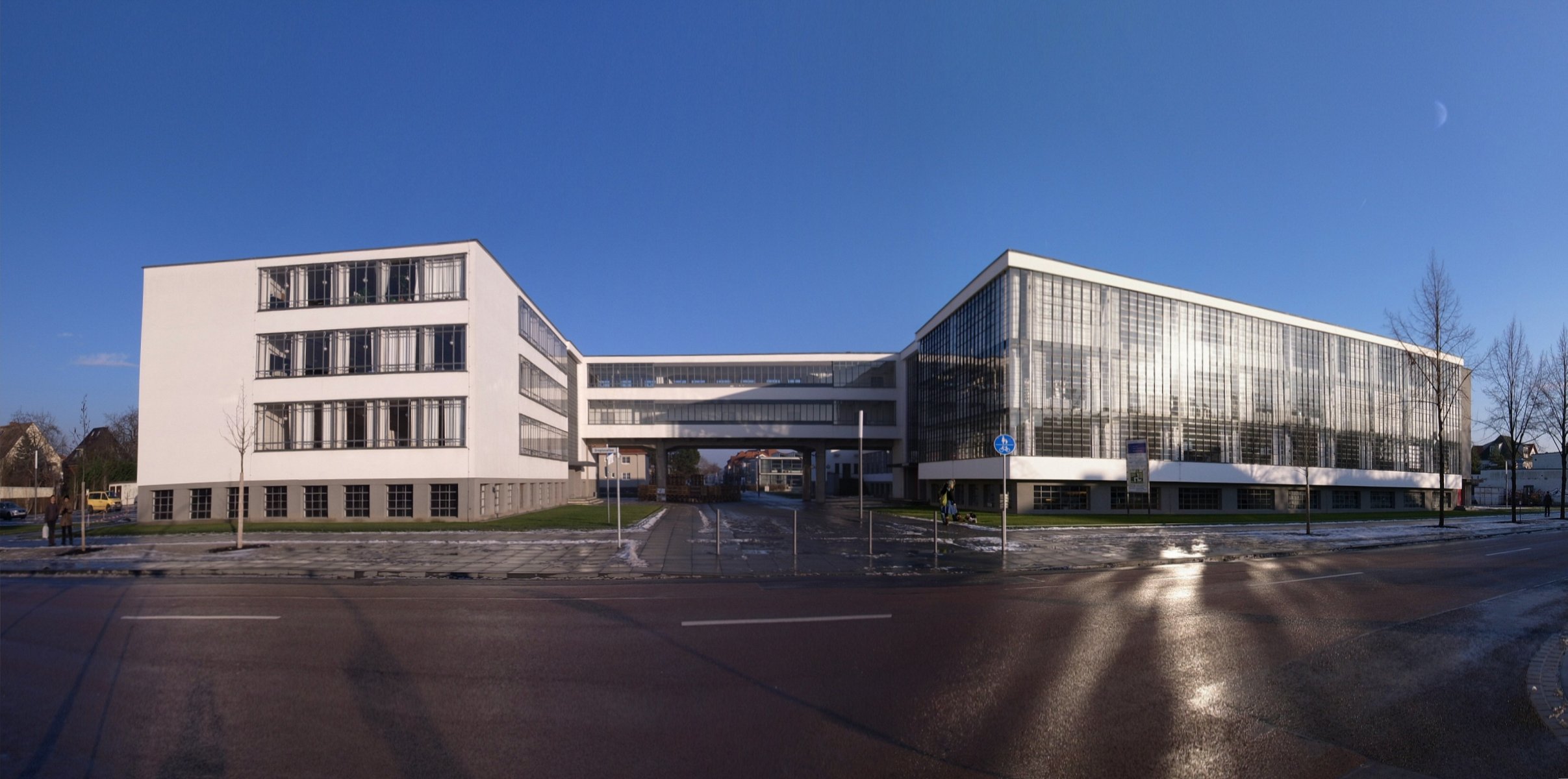
A social programme first, a style second.
Housing shortages, mass production, and post-war utopianism produced the ideas. The white walls and sans-serif type came afterwards, as consequences.
How it got exported.
A German school shut down by the Nazis, a 1932 exhibition in New York, and a Swiss printing industry — three accidents that turned a European argument into a global default.
Why your design system looks like this.
Grids, tokens, "as little design as possible," and the flat-design decade. Modernism didn't die in 1972. It moved into software.
The conditions that made it necessary.
By 1900 European cities had absorbed a century of industrialisation without redesigning anything about how people lived in them. Factories could produce objects in quantities no craft workshop could match, and the objects they produced were mostly imitations of handmade ones — machine-carved ornament, stamped metal pretending to be cast, veneer pretending to be timber. The gap between what the machine could do and what it was being asked to do was the opening problem, and it was as much moral as visual.
The Deutscher Werkbund, founded in Munich in 1907, was the first serious institutional attempt to close it. It put architects, designers, industrialists, and craftsmen in the same organisation and asked a blunt question: what should mass-produced goods actually look like, given that they are mass-produced? The answer split the membership. One faction wanted Typisierung — standardised types, repeatable, designed once and made forever. The other wanted room for the individual artist. That argument, staged publicly at the Werkbund's 1914 congress in Cologne, is still the argument every design system review has.
Ornament as an ethical problem
The Viennese architect Adolf Loos took the harder line. His lecture Ornament and Crime — usually dated to 1908, though the surviving record has him first delivering it in Vienna in 1910, and it was not published in German until 1929 — argued that applied decoration was a waste of labour and material, and that a culture confident in its own time would stop producing it. The rhetoric is overheated and parts of it have aged badly. The underlying position did not: ornament costs someone's hours, and those hours are a design decision.
Then the First World War removed any remaining case for continuity. Europe came out of it with destroyed housing stock, a collapsed aristocratic order, and — after 1917 — a live example of a society claiming to rebuild itself from first principles. The Victoria and Albert Museum's account of the period is direct about the mood: modernism grew out of a widespread conviction that society needed to be rethought entirely, and that new creative methods were the instrument for doing it.
"Form follows function" is a misquotation of a misreading.
Louis Sullivan wrote "form ever follows function" in 1896, in an essay about tall office buildings, and he meant it in a loosely biological sense — the way a form emerges from what a thing is. It was later flattened into a slogan for stripping decoration, which is not quite what he said. The phrase's career is a good early warning about what happens to modernist ideas once they travel.
Fourteen years, three cities, three directors.
The Bauhaus is the most over-referenced and least accurately remembered institution in design history. It ran for fourteen years. It graduated a few hundred students. It was, for most of its existence, financially precarious and politically besieged. Its actual innovation was structural rather than stylistic: a curriculum where every student passed through a shared foundation course — the Vorkurs, material and form studied without reference to any specific trade — and then into a workshop where art and manufacture were taught by two masters at once, one artist and one craftsman.
What that produced was not a house style so much as a method for arriving at one. And the school changed its mind about its own purpose roughly every five years, which is why "Bauhaus" as a visual label is so slippery.
- 1919 – 1928
Walter Gropius — the founding synthesis.
Opened in Weimar in 1919 by merging an art academy with a school of applied arts. Early years were closer to expressionist craft revival than to the steel-and-glass image; the 1919 manifesto called for architects, sculptors and painters to return to the crafts. The move to purpose-built premises in Dessau in 1925 is where the school starts looking like its own reputation.
- 1928 – 1930
Hannes Meyer — the political turn.
A Swiss Marxist who pushed the school hardest toward its social brief: architecture as the organisation of needs, not the composition of forms. Under Meyer the Bauhaus took on more paid commissions and became more explicitly left-wing. He was forced out in 1930, largely for that reason.
- 1930 – 1933
Ludwig Mies van der Rohe — the retreat and the end.
Brought in to depoliticise the school and keep it alive. Dessau's council, by then Nazi-controlled, closed it in 1932; Mies reopened it as a private institute in a disused Berlin telephone factory, and shut it permanently in 1933 under Gestapo pressure.
The closure is why you've heard of it
Suppression turned a regional school into an international network. Gropius and Marcel Breuer went to Harvard. Mies went to the Illinois Institute of Technology in Chicago and, later, to Park Avenue. László Moholy-Nagy founded the New Bauhaus in Chicago in 1937, which became the Institute of Design. Josef and Anni Albers went to Black Mountain College in North Carolina, and Josef eventually to Yale. Herbert Bayer went into American advertising and brought the school's typographic thinking with him.
The diaspora carried the pedagogy but not the politics. Meyer's version of the Bauhaus — the one that treated design as a redistribution question — did not make the crossing. The version that did was the one about clean form, and it arrived in a country with a booming corporate sector looking for exactly that.

How a movement became a corporate language.
Modernism's institutional machinery matters more than any single building, because the machinery is what made it portable. Four bodies of work did most of the exporting.
| Vehicle | Date | What it did |
|---|---|---|
| CIAM | 1928 | Founded at La Sarraz, Switzerland. Gave modernist architects a standing international congress and a shared agenda for the industrialised city. |
| Athens Charter | 1933 / 1943 | CIAM's fourth congress produced the doctrine of the functionally zoned city — dwelling, work, recreation, circulation as separate systems. Le Corbusier published his version a decade later. It became the template for post-war planning almost everywhere. |
| MoMA 1932 | 1932 | Henry-Russell Hitchcock and Philip Johnson's exhibition Modern Architecture: International Exhibition and its companion book named "the International Style" — and in doing so redefined a social movement as a coherent aesthetic. The naming was the turning point. |
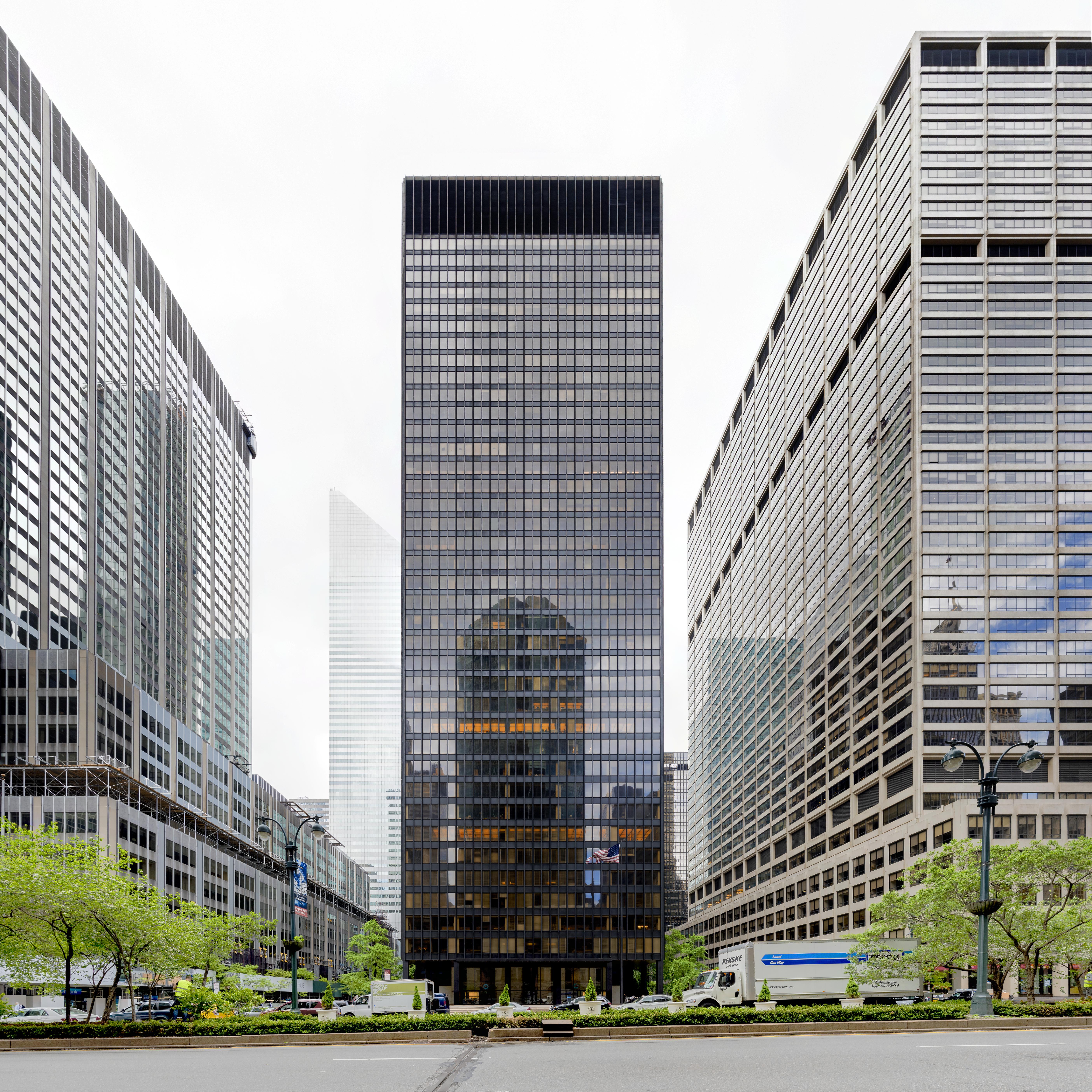
| Seagram | 1958 | Mies and Johnson's bronze-and-glass tower on Park Avenue, set back behind its own plaza. The moment modernism stopped being oppositional and became the preferred architecture of American capital. |
The 1932 rebranding is the pivot the rest of this issue hangs on. Hitchcock and Johnson were art historians looking for a formal vocabulary they could describe: volume rather than mass, regularity rather than symmetry, no applied ornament. All three of those are accurate descriptions of what the buildings looked like. None of them mentions housing, or labour, or cost. Once the style was separable from the argument, the style could be bought.
By the late 1950s that is exactly what happened. The same formal language that had been used to argue for workers' housing in Dessau was being used for distilled-spirits headquarters in Manhattan, and it worked beautifully for both — which tells you something uncomfortable about how much of the ideology was ever load-bearing.
The grid gets a job.
The strand of modernism that survives most intact today is not architectural. It came out of Switzerland in the 1950s, and it is the reason a designer in 2026 can say "the grid" and be understood without further explanation.
Swiss designers — Josef Müller-Brockmann in Zurich, Armin Hofmann and Emil Ruder in Basel — took the Bauhaus interest in objective form and turned it into a working method: a modular grid, asymmetric layout, flush-left ragged-right setting, photography rather than illustration, and sans-serif type doing nearly all the work. Müller-Brockmann's Grid Systems in Graphic Design, published in 1981, is still in print and still gets bought by people building CSS layouts.
Two things made it spread. The first was that Switzerland had a strong printing industry and a genuinely multilingual domestic market, which puts real pressure on clarity. The second was 1957, a year in which Helvetica (as Neue Haas Grotesk, by Max Miedinger with Eduard Hoffmann at the Haas foundry in Münchenstein) and Univers (Adrian Frutiger, for Deberny & Peignot) both appeared. Neither came out of a Swiss Style studio. Both became its instruments almost immediately, because multinational corporations building their first global identity programmes needed a typeface that would behave the same in eleven markets.
HfG Ulm — the sequel school.
Founded in 1953 by Inge Aicher-Scholl, Otl Aicher and Max Bill, with Bill — a Bauhaus graduate — as first rector. Pushed modernism toward systems, semiotics and method; closed in 1968 after the state withdrew funding.
1953 – 1968Braun — the method applied.
Braun's postwar product programme was developed in direct collaboration with Ulm, notably through Hans Gugelot. It is the clearest case of modernist theory producing objects people actually bought in volume.
from 1955Dieter Rams — the compression.
Forty years at Braun, and a ten-point list — innovative, useful, aesthetic, understandable, unobtrusive, honest, long-lasting, thorough, environmentally friendly, and "as little design as possible." Modernism's ethics, restated as a checklist.
1955 – 1995Rams's tenth principle — Weniger, aber besser, less but better — is where the whole tradition gets small enough to carry. It also carried the ambiguity with it. "As little design as possible" can be a discipline about respecting the user's attention, or it can be an excuse for shipping something under-considered and calling the gaps restraint. The list does not distinguish, and the last fifteen years of software have exploited that.

Where it actually broke.
The standard story has a time of death. Charles Jencks opened The Language of Post-Modern Architecture in 1977 by announcing that modern architecture died in St. Louis on 15 July 1972 at 3.32 p.m. — the demolition of blocks of the Pruitt-Igoe housing project, designed by Minoru Yamasaki and occupied from the mid-1950s. It is a great line. It is also, on the evidence, mostly wrong about causation.
Pruitt-Igoe's failure was structural in the non-architectural sense. Federal funding covered construction but almost nothing for maintenance. St. Louis lost population fast, so the project never filled; occupancy fell to around half. Segregation, and then the racialised politics of welfare housing, shaped who lived there and how little the city spent on them. Reappraisals of the project — including a substantial body of work published around the 50th anniversary of the demolition — argue that blaming the towers let the institutions off the hook, and that Jencks's diagnosis was convenient for the movement he was launching.
The real critique came earlier, and it was about cities
Jane Jacobs published The Death and Life of Great American Cities in 1961, more than a decade before Pruitt-Igoe came down. Her target was precisely the Athens Charter model: separate the functions of a city into zones, clear the messy old fabric, and you remove the dense street-level mixing that makes neighbourhoods safe and economically alive. That argument landed because it was empirical. Robert Venturi's Complexity and Contradiction in Architecture (1966) and Learning from Las Vegas (1972, with Denise Scott Brown and Steven Izenour) made the aesthetic version of the same case: the ordinary built environment is full of meaning, and refusing to read it is not rigour.
The deeper problem was universality. A method that claims to derive form from function alone has to assume a universal user, and the universal user of mid-century modernism was narrower than advertised. Margarete Schütte-Lihotzky's Frankfurt Kitchen of 1926 is the honest test case: rigorously time-and-motion optimised, genuinely liberating in its efficiency, and designed around the unquestioned premise of one woman working alone in a small sealed room. The rigour was real. So was the assumption underneath it.
Postmodernism did not replace modernism. It fragmented the monopoly.
Modernist practice continued without interruption through the 1980s and 1990s — high-tech, minimalism, and most corporate architecture are all directly descended from it. What ended in the 1970s was the belief that there was one correct answer and that trained professionals held it.
Why your interface looks like 1957.
Software design inherited modernism almost by accident, and then inherited it again on purpose.
The first pass was structural. Screens are grids. Type on a screen has to hold up at small sizes across unknown displays, which is the same constraint that produced neo-grotesque type in the first place. Every layout system in front-end development — the twelve-column frameworks, CSS Grid, the 8-point spacing scale, the spacing and type tokens in every design system — is a direct implementation of Müller-Brockmann's modular grid with different syntax.
The second pass was ideological, and it happened in public between 2010 and 2014. Microsoft's Metro language, introduced with Windows Phone in 2010, cited Swiss transport signage as its explicit reference. Apple's iOS 7, in 2013, stripped out the leather stitching and linen textures of the previous era in a single release. Google's Material Design followed in 2014, and did something more interesting than either: it wrote down a physical metaphor — surfaces, elevation, shadow as a depth signal — and then held the whole system to it. Rams's principles were quoted constantly through all of it, usually as authority for removing things.
And then the same failure, again
Flat design solved real problems: decorative excess, inconsistency, interfaces that were harder to read than the content in them. It also removed the affordance cues that told people what was pressable, and it made a decade of products look interchangeable. Sound familiar — a method that starts as clarity, gets adopted as a look, and ends up producing sameness that nobody chose? The current move back toward material, depth and translucency in platform interfaces is the same correction the built environment made in the 1970s, arriving about fifty years later on a smaller substrate.
The useful lesson is not "modernism was right" or "modernism was arrogant." It is that this tradition supplies a method for making decisions and a vocabulary for justifying them, and the two come apart very easily. The method is still the best one available. The vocabulary is what gets you a beautiful, empty, unusable screen.
- Constraint before subtraction. Modernism removed ornament because a specific production constraint made it dishonest. Remove things because something forces you to, not because removal is the aesthetic.
- Name the user you're optimising for. "Universal" is a claim, and it is almost never true. The Frankfurt Kitchen was rigorous and still assumed one woman alone in a room.
- A grid is a decision-reduction device. Its value is that it settles a thousand small arguments in advance. If your grid is generating arguments, it is the wrong grid.
- "As little design as possible" needs the second half. Rams wrote less, but better. Shipping less without the better is not restraint, it is an unfinished product with a good excuse.
- Affordance is content. The shadow that tells someone a thing is tappable is doing work. Flattening it away is deleting information, not decoration.
- Watch for the 1932 move. The moment a practice gets renamed after its appearance rather than its argument, the argument is about to be optional. That happens to design systems too.
Modernism's real inheritance isn't the white wall or the sans-serif — it is the idea that form is an argument you owe people a reason for. Its failure mode has been consistent for a hundred years, from Dessau to iOS 7: the reason gets forgotten, the form gets kept, and everything starts to look the same for no reason anyone can name.
Sources & Further Reading
Britannica — Modernism (art)
Wikipedia — Deutscher Werkbund
Wikipedia — Ornament and Crime (dating and publication history)
Adolf Loos — Ornament and Crime (English text, PDF)
Wikipedia — Bauhaus
Bauhaus Dessau Foundation
Wikipedia — The International Style and the 1932 MoMA exhibition
Wikipedia — CIAM and the Athens Charter
About Switzerland — Swiss Style forever: the story of a graphic design tradition
Wikipedia — Josef Müller-Brockmann
PRINT Magazine — Swiss Style: the principles, the typefaces, the designers
Wikipedia — Ulm School of Design (HfG Ulm)
Design Museum — Dieter Rams' Ten Principles of Good Design
iF Design — 10 principles for good design, by Dieter Rams
Greyscape — Modernism Was Framed: The Truth About Pruitt-Igoe
Hyperallergic — Why is Modern Architecture to Blame? The Pruitt-Igoe Myth
Dezeen — Reports of modernism's death turned out to be greatly exaggerated
Azure — Charles Jencks, 1939–2019: Postmodernism With a Capital P
Wikipedia — Frankfurt Kitchen, Margarete Schütte-Lihotzky
Material Design — foundations and vocabulary
Apple Scoop — The end of skeuomorphism: how iOS 7 changed UI design